The brief
for our preliminary task was to recreate a music video of our choice. We needed
to try and make it as accurate as we could. For the task we had to find an
artist of our choice and research into their label, music and videos. For our
preliminary video we chose to recreate Tom Rosenthal's video to his song Us.
Before creating the video we needed to research the video and how we were going
to recreate it.
To find and
watch the video we were able to use YouTube, this platform allowed us to watch
and listen to the song for free. It was useful for learning about techniques
such as editing to be beat. We were able to pause and play the video between
cuts so we were able to analyse the cutting to the beat. Something else that
needed to be done before we could create the video was to analyse the lyrics.
By analysing the lyrics and the video we could begin to understand the meaning
behind the images created in the video. For this we used a website called A-Z
lyrics, it was able to give us a full copy of the lyrics which was useful for
analysing.
The next
stage was to begin filming, for this we used 1100D and a tripod for this. For
our video the main shot type that we use was a wide/ long shot some the
composition of the shot was something that we really needed to consider. We had
pre-planned out locations however they were located is separate places, so time
management was something we were really aware of this day. It taught is about
being to efficient and planning a schedule, we needed to know what shots we
wanted to achieve on location as we would not have long there.
After this
we began to edit the footage, something we did not have to consider although
did during our own video was lip syncing. However we did have to match up a lot
of actions so they would match the original video and lyrics. This taught us
valuable timing skills for when it came to our real video has we already had
some skills with timing and matching up lip syncing and
actions.
You can see by comparing the video that we crated and the one that we were trying to copy that our preliminary was a success. You can see when you play the two side by side that the editing and actions all match up in time with each other. It was difficult to get the locations exactly the same however we felt that we did a pretty good job and matching them up to the best of our ability. The only are that was our fall down would have been the costume as we did not have anything blue that matched however we decided to go with matching yellow as it was what was available to us. Overall the use of our media technologies has helped us during every stage of our preliminary task and helped us to complete that task at a good standard.
Research
This
research part consisted of two main parts of research, research of music videos
and the conventions and then research into our audience. For the research into
music videos YouTube was probably the most useful platform as you can find a
range of videos and genres on there. It was then once we had found the video
and researched into it that I then needed to present my findings. I used a
range of different technologies to present my work that I was then able to
upload to my blog on Blogger. Blogger is a very good site for using a range of
technologies to present your work as it allows you to embed and you can add
things such as videos and images. Blogger also allows me to organise my work
effectively, I could create different sections in my blog for diffident stages
eg preliminary, research, planning and production. I can also link my work on
my blog making it easily accessible for anyone looking for a piece of my work.
Here is some
on the Technologies that I used and how they were effective for presenting my
work:
For this section of my work I definitely used
a new technology that I had never used before. We found that we were doing a
lot more work on paper such as the storyboard and the deconstruction of song
lyrics. We could have simply taken a picture of the paper however it would not
have been very clear. So instead we used a scanner to upload the work, this
made the images far clearer and much easier to read. We also used to upload our
first drafts of our ancillary’s. Again for planning I again used prezi,
powtoon, padlet and slides to present my work.
Production
 The first stage of our production was to
collect all of our footage in total we had about 4 different filming days at
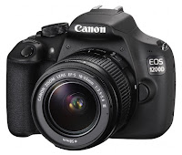
different locations. To film we used a cannon 1200D and a tripod. This camera
is a DSLR camera so we knew that we would be able to collect good footage of a
high quality. We then again used this same equipment to create our ancillary’s,
we shot our ancillary’s at the beach location so we did not have to plan a
separate photo-shoot although did need to make sure that we took time out of
filming to get the pictures.
 Construction
To create and edit our final package we used two different technologies, we used iMovie to edit the video and Photoshop to create the advert and digipack. Both of the technologies had been used before however we needed to use a range of new techniques during the construction process.
Video
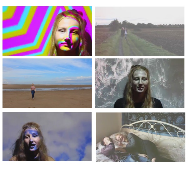
To edit our final cut we used iMovie. The first section of the movie has an effect on it.
Once you open up iMovie you get all your different projects and to create our effect we needed a new project. We used two different overlays to create the first effect, you have to drag it down into this section and to get them over each you drag that one over as well.
Now, on the top one you change the opacity so that now they play together and you can cut them to the same length. There is the effect. You then need to save it and add it to your cut, once you add it, it will appear in this section here where you can then again drag it into this area and again all you need to do is change the opacity and will play on top of the footage.
We then added this text here, which is quite easy as in iMovie as you simply click on text (the T). For our text we had to download it, so to be able to find in you click on show fonts and you have the downloaded fonts. You can see how you added it all together, you have the first effect.
The second editing technique we used jump cuts. In the footage you can see here, there, here, here and here. To do this you drag the original footage on, now you need to select it, cut from command B. We're going to make a cut here, delete this whole section of footage, we can see there's a jump cut. We can do it again here, select it , control B, make her appear the other side. As you can see it is quite easy to create a jump cut.
If you move further along in the video, you can see we edited to the beat and made it almost stutter kind of jump cut again. It makes the video link in with the music and cut to the beat more. You can see here the original video I just added in another section, this is just a run so we had to cut it here and create the effect. What we had to do is select the section where she jumps which is here, we cut this, control B again. What we had to do is cut it, so it is 1 second and then command C (copy), command V (paste) , and do this around 3 or 4 times. You can see here we are able to put them next to each other which creates that effect.
In the same section of video you can see we added this effect. It's called a white lens and it adds the retro effect we wanted, it is similar to the effect at the start that we used.
All we had to do is download this lens flare effect, click and drag and put it like the same area we just edited, again like the effect we edited at the start we click, change the opacity and drag it where you like. Here it just plays on top of the video and gives the vintage effect.
Further along the video you can see we've used this a couple of times. We have created this mirror effect. The original footage here is just spinning on the beach ,you select the original footage, control C to copy it and like the effects you need to put it so that it is over the top, and then iMovie has an effect to where you can flip it so it is on the other side of the screen. Then all you have to do is go back to the opacity and change it and make it so that it is in the middle and yo ucan see here we've created the mirror effect.
Advert
The first thing we did was find the image we wanted to use.
We had a few to choose from so focused on the picture that would be most conventional.
The most conventional thing to have when thinking of putting an image on your advert/poster is the face.
We had many pictures we could possibly use, as shown here. There were many to choose from. However, we decided to go with this image as it had the direct eye gaze wanted and the face was in the image and it was of a close-up which are all conventions of an advert.
We then had to resize it so that it fit appropriately as the image was much larger and the scale was much less than what it is now. Obviously we wanted to have the image itself in and the face as the closest part, and as you can see here it goes off the page.
Once we resized it, we then thought about the effects we wanted to put on it. This is the same as the effects on the digipak and the method, so to keep the synergy between them all.
Again, this involved using the vibrance, curves and hue/saturation. We did this by going onto layer and adjustment layer which has the selection to play about with each layer. For example, vibrance. As you can see it makes it go from more dull to black and white to more vibrant.
We then thought about adding other assets such as the brands and logos from other music related companies and the title of our band and the name of the song.
We went on to Dafont again and used one of their fonts that we wanted to use. We then screenshotted the text when it had the words we wanted written, like so. We then opened it up in Paint and saved it as a JPEG as this made the quality much better.
I'll now show you have we cut around it, I will open the example. We then got the magic wand tool and cut around it, to remove any white.
We then copied and pasted it onto the advert and resized it and coloured it to how we want. The way we coloured it was by adding a colour overlay and drop shadow by clicking on the layer with checkerboard sort of look and we've got the option to play around with each thing. For example, the colour layer on December changes from dark to 100%. We can see here we have the drop shadow which makes it stand out and look bolder and more professional.
Along with the assets we did the same as the Dafont. We found the image we wanted, opened it up in a new Photoshop document and used the magic wand tool to cut around each thing so the white backing was off, so that it was just the words and picture itself. This was the same for the Hopeless Records. We then added another drop shadow and colour overlay so they all matched and synergised, this was the same for the stars as well.
For the NME and Mojo, we did similar to what we did to the lyrics on the digipak. We wrote the text out and sized it using the metrics and the widths, you then have the little page/line thing and can make it bigger and move. This is what we did with the NME but made it look more professional and made it spaced out evenly so it fitted in a balanced way. We also put a stroke on which makes it stand out and look more effective. As you can see here, you can make it really big or small.
Each of these colours are also all picked from somewhere from within the image. Mojo came from the t-shirt, the white from the text.
Digipak
Script:This is our final digipak.
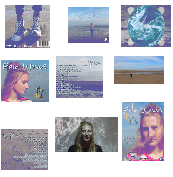
Firstly, we went onto Google and found a digipak template, like the ones below. When we found that we opened it into Photoshop and had to find the correct dimensions, heights and widths needed to make the correct sized digipak.
This resulted in us having to go onto the canvas size and turning the centimetres in millimetres and then inputting the right dimensions.
We then had to insert a rectangle shape, which you can see here. To separate the boxes evenly to make sure we had the correct size between each one, and we also had a line that blends in nicely to split the two different parts.
The first thing we did was add the images, which you can see here in the background. We started with the first square which was gong to be the front cover which is always the best lace to start as it is the most important due to being the first thing the audience will see. This involved us having to alter and move the image itself as it was too big to fit into the square, and we wanted the face mainly in the shot due to being a main convention of a digipak and other advertising, promotional items. I will show you how big the original image was.
You can see here I've had to chop away and erase some parts to make it fit. I then had to change the scale so that it fit as well, this is the same with other parts that also overlap onto other images, but I've put it under and over the layer so that they fit equally. I will find an example, as you can see here the square goes outside and if I had left it on top of the other layers it would have gone over. This isn't what you wanted and wouldn't look professional.
This part was more complex. This involved us finding a sea/ocean picture and having to add it to the CD casing from the template. This involved us having to cut around parts using the magic wand tool, mainly the white inner part of the CD case which is now gone. Then I having to erase parts (of the sea image and template) so that it fit correctly. As you can see this is the background, there is also a line of the original case shape but helped to put it in nicely and make sure it was the right size. As you can see it is the correct sizes.
You can also see here jagged and uneven edges from the cutting out is which I used the magic wand tool again and an eraser to erase parts needed.
Alongside this part, we also made the opacity of these CD parts lesser, so that the background showed through and connoted the sea theme further. If I can find the layer I will show, as you can see here it comes and goes. The opacity if you can see here is 61% and we did this to make it look more professional.
Other image assets we added were the barcode and other company brands and their logos. Originally, they weren't white. The colours they originally were didn't fit or blend in with the theme of our digipak and didn't synergise well. This involved clicking on their layer which brought up the option to add effects and make them look more professional. I added a colour overlay which turned the whole object one colour, you can do it here by changing it to a variety of colours. I also added a drop shadow which made it stand out more and look bolder. You can change the blending mode, angles, size and spread of the shadow itself. I also added a barcode to make it look conventional and like a real life digipak.
Preliminary to final video
You can clearly see that if you compare our preliminary video to our final video that their has been clear improvements. This has been due to or use of media technologies and how we have improved them. The first thing you can clearly see is an improvement is the quality of the video. One factor that helped our quality was the camera that we used, for our preliminary we used a 1100D and or the final video we used the 1200D this upgrade helped to improve the quality. Another thing that helped the quality was the way that we were able to save and render the video, we edited using iMovie and it allows you to save the file as a iMovie pro file and this does make the file a much larger size however it really improves the quality of the footage.
Another way we have improved was in terms of our video was how conventional the video was, our final video was far more conventional to our genre. This was mostly sure to us doing far more research and being able to put it into technologies so that we could refer back to it during the planning process. Blogger makes it easy to go back and find research posts so when you are planning you can go back to them to use in your work.
AS to A2
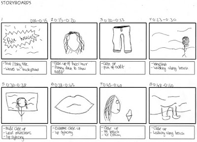 If you look at our thriller opening storyboard you can see that technologies were not used to the best of their abilities and we simply took a picture of our storyboard and we uploaded the images. At A2 we used a new technologies and scanned on our storyboards. This made them far more clearer and you could easily see what each shot was going to be. We also improved the length and detail in our story boards. Our storyboard at AS was 31 shots long yet our A2 one was 56 shots, and yes our A2 video was much longer but you can see that we included far more shots than what was on the storyboard at AS. You can see we learnt from this and made our A2 board far more detailed.
Our quality of footage and equipment also improved, the camera that we used was upgraded giving us a greater quality of the footage that we ere able to produce. However we did learn that from our AS production that lighting can also really effect the quality of out footage. So planning around the weather and making sure that all of our shots were well lit was something else that we considered, making sure that we filed at a good time in the day and that the sun was out. All of this helped us to improve the quality from our AS video to A2.


